Create your own UI component library
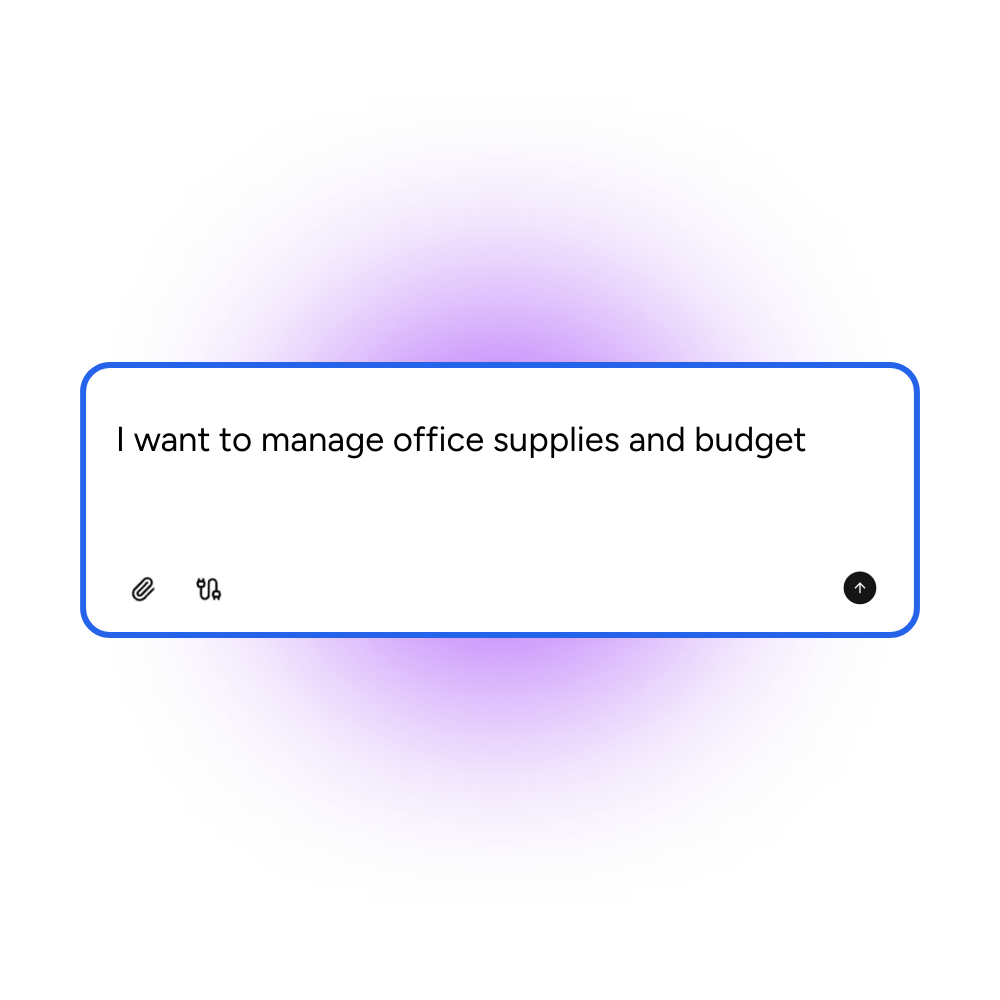
Tell Appaca what components your team uses, how they should be documented, and what preview formats you need, and it creates a component library that fits your design system without building a documentation site from scratch.
Trusted by incredible people at
What you can make with Appaca
Appaca is a platform for personal software, so your component library can match your design system conventions instead of a generic documentation template.
A catalog organized around your design system
Group components by category, status, or complexity. Document props, variants, and usage guidelines so developers and designers find what they need without digging through code.

Previews and examples alongside documentation
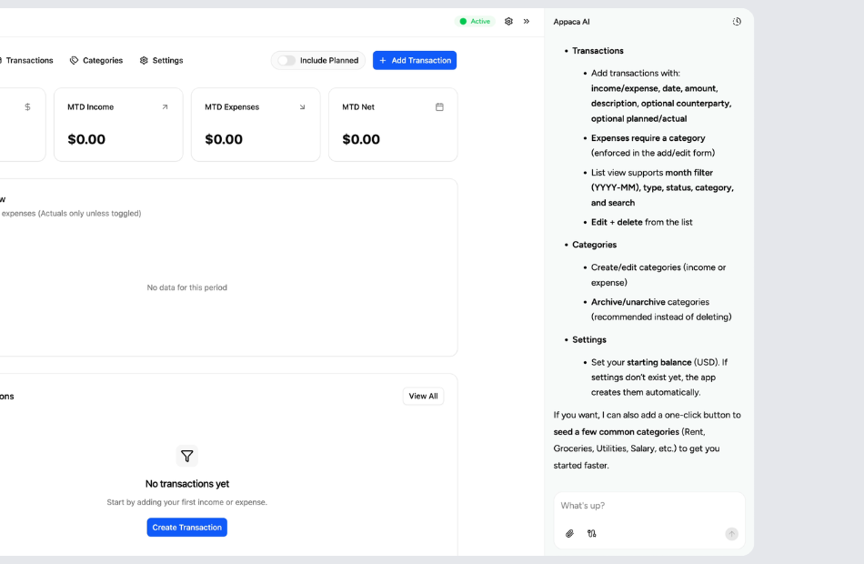
Show live or static previews of each component alongside its API, do/don't guidance, and code snippets. Keep visual reference and technical detail in the same place.
Built-in database and shareable access
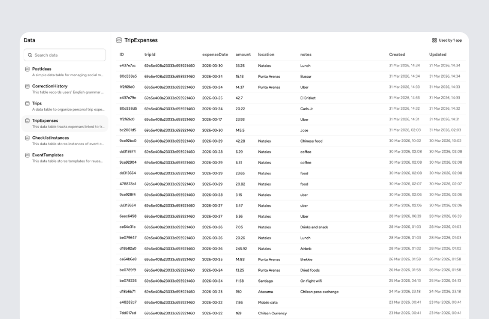
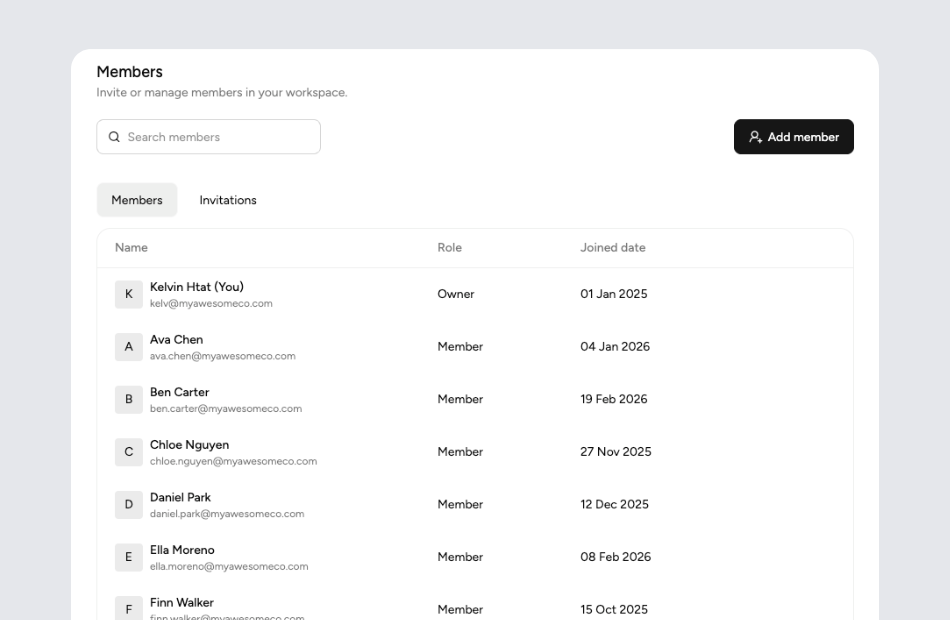
Every component entry, design token, and usage example is stored in a built-in database. Share the library with your entire product team for a single source of truth.
Personal software for product and design teams
Start with your design system. Appaca creates the component library around your conventions, and you can keep refining it as your system grows.
Start with your components and conventions
Tell Appaca about your component hierarchy, naming conventions, variant structure, and what metadata each component entry should include-status, owner, version, or accessibility notes.
Let Appaca shape the library around your system
You can describe layout preferences, search and filter behavior, how tokens are organized, and what preview formats your team uses. Appaca turns that into a browsable component library.
Share it with designers and developers
Invite the entire product team into the workspace so everyone references the same components, guidelines, and design tokens without outdated PDFs or bookmarked wiki pages.
What is a UI component library?
A UI component library is a curated collection of reusable interface elements-buttons, inputs, modals, cards, navigation patterns-documented with usage guidelines, props, variants, and examples. It serves as the single source of truth for how a product is built visually and functionally, bridging the gap between design files and production code so teams stay consistent.
Key features to look for in a UI component library
Organized categories and search let team members find components quickly. Live or static previews show what each component looks like in context. Prop documentation and variant examples reduce guesswork. Status indicators-stable, experimental, deprecated-prevent adoption of unstable components. Design token references for colors, spacing, and typography ensure consistency beyond individual components.
Why build your own UI component library with Appaca
Tools like Storybook require setup and maintenance alongside your codebase. Wiki-based documentation goes stale quickly. Appaca lets you describe your component catalog, documentation needs, and team workflow, and builds a living library that is easy to update. Add new components, update status, or restructure categories as your design system evolves without rebuilding the documentation infrastructure.
Questions & answers
It documents and catalogs reusable interface elements so designers and developers build consistently. Instead of reinventing buttons or modals, teams reference the library for approved components, their variants, and usage guidelines.
A design system includes principles, tokens, patterns, and guidelines. A component library is the catalog of specific UI elements within that system. Appaca can build both the component catalog and the broader design system documentation in one app.
Yes. Describe the metadata you want-status labels like stable, experimental, or deprecated, plus ownership, version numbers, and accessibility notes. Appaca includes those fields in every component entry.
Storybook provides interactive code-level previews tied to your codebase. An Appaca component library is better for team-facing documentation, guidelines, and visual reference. They can complement each other or you can use Appaca alone for lighter documentation needs.
Absolutely. Product managers, designers, and marketers can browse the library to understand available components, their intended use, and visual variants-without needing to read code.