
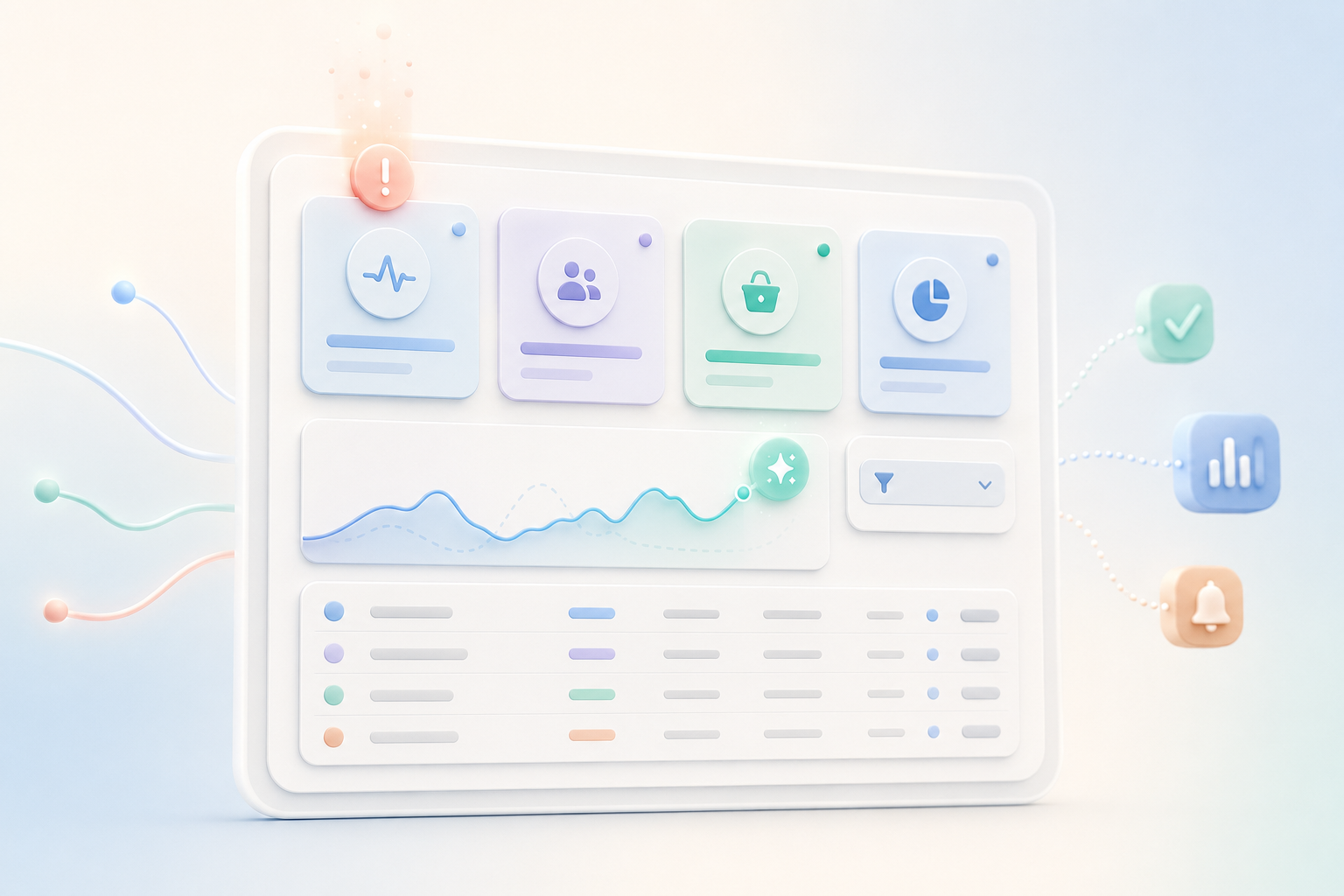
You can build an operations dashboard without code by defining the decisions and metric rules before choosing any charts. This tutorial turns weekly orders, sites, incidents, and staffing data into a role-based Appaca dashboard with five KPIs, useful filters, exception alerts, drill-down records, and AI commentary that describes changes without guessing at causes.
What you will build
The finished dashboard will include:
- Five clearly defined operations metrics
- KPI cards for the current period
- Week-by-week trend charts
- Filters for date and site
- Drill-down tables behind each number
- An executive view
- A site-manager view
- Alerts when a metric crosses a limit
- A scheduled AI summary that uses only the dashboard data
Appaca can build this as a complete internal app with a database, team access, data connections, filters, automations, and managed hosting. See the custom dashboard builder for the platform overview.
Step 1: define the decision before the chart
A dashboard should help someone make a decision. If a chart does not change an action, it may not belong.
For this tutorial, the dashboard must help leaders answer:
- Are orders being completed on time?
- Which sites have serious open incidents?
- Is incident resolution getting faster or slower?
- Which sites are below their staffing target?
- What changed compared with last week?
The site manager needs the same questions filtered to one site. The executive needs a wider view across all sites. This difference will shape permissions and default filters later.
Step 2: prepare the source workbook
Use a workbook with four tabs or four CSV files.
Orders
| Field | Example |
|---|---|
| Order ID | ORD-1042 |
| Site ID | SYD-01 |
| Created date | 2026-07-10 |
| Due date | 2026-07-12 |
| Completed date | 2026-07-11 |
| Status | Completed |
Sites
| Field | Example |
|---|---|
| Site ID | SYD-01 |
| Site name | Sydney Central |
| Region | NSW |
| Manager email | [email protected] |
| Staffing target | 18 |
Incidents
| Field | Example |
|---|---|
| Incident ID | INC-220 |
| Site ID | SYD-01 |
| Severity | High |
| Opened date and time | 2026-07-14 09:10 |
| Resolved date and time | 2026-07-14 15:40 |
| Status | Resolved |
Staffing
| Field | Example |
|---|---|
| Staffing record ID | STF-501 |
| Site ID | SYD-01 |
| Week start | 2026-07-13 |
| Active staff | 16 |
Give every record a unique ID. Use one date format, one site ID list, and one set of status values. Do not use colour or cell position as data.
If your source is messy, read our comparison of the best spreadsheet-to-app builders before importing it.
Step 3: create a metric dictionary
A metric dictionary is a short table that says exactly how each number is calculated.
| Metric | Definition | Formula | Owner |
|---|---|---|---|
| On-time completion rate | Share of completed orders finished on or before due date | On-time completed orders / all completed orders | Operations lead |
| Open high-severity incidents | High or critical incidents not resolved | Count of open high and critical incidents | Safety or support lead |
| Average resolution time | Average hours from incident open to resolved | Sum of resolution hours / resolved incidents | Operations lead |
| Sites below staffing target | Sites where active staff is below the target for the selected week | Count of below-target sites | People operations |
| Week-over-week exceptions | Metrics or sites that moved past an agreed limit compared with last week | Count of defined exceptions | Operations lead |
Add these details for every metric:
- Time zone
- Date field used
- Included and excluded statuses
- How blank values are handled
- Rounding rule
- Update schedule
- Named owner
For example, decide whether an order completed without a due date is excluded or counted as late. There is no chart setting that can fix an unclear definition.
Step 4: design the data model
Create linked tables for Sites, Orders, Incidents, Staffing, and Users.
Use Site ID as the link, not the site name. Names can change or be typed in different ways. A stable ID keeps relationships reliable.
Add a Users table with:
- Name
- Role
- Assigned site
- Active status
Use two main roles:
- Executive: can see all sites and overall metrics
- Site Manager: can see only the assigned site and its drill-down records
If finance, HR, or customer data will later appear, add separate access rules. Do not make every dashboard viewer an admin.
Step 5: paste this Appaca prompt
Open Appaca, create a new app, and paste the prompt below.
Build a no-code operations dashboard from four related data sets: Sites, Orders, Incidents, and Staffing.

Create these tables:

1. Sites: site ID, site name, region, manager email, staffing target, active status.
2. Orders: order ID, site, created date, due date, completed date, status.
3. Incidents: incident ID, site, severity, opened date and time, resolved date and time, status, owner, summary.
4. Staffing: staffing record ID, site, week start, active staff.
5. Users: name, email, role, assigned site, active status.

Create these metrics:

- On-time completion rate: completed orders where completed date is on or before due date, divided by all completed orders with a due date.
- Open high-severity incidents: incidents with severity High or Critical and status not Resolved or Closed.
- Average resolution time: average hours between opened and resolved times for resolved incidents.
- Sites below staffing target: sites where active staff for the selected week is below the site's staffing target.
- Week-over-week exceptions: show sites or metrics that crossed a defined threshold or worsened by more than 10 percent from the prior week.

Create an Executive Dashboard with:

- Five KPI cards for the selected date range.
- Weekly on-time completion trend.
- Open incidents by severity and site.
- Average incident resolution time trend.
- Staffing target versus actual by site.
- An exception table with site, metric, current value, prior value, and change.
- Filters for date range, region, and site.
- A drill-down table for each metric.

Create a Site Manager Dashboard with the same core metrics, automatically limited to the signed-in manager's assigned site. A site manager must not be able to open another site's records through a direct link.

Create these roles:

- Executive: can view all dashboards and records but cannot change source records.
- Site Manager: can view only the assigned site's dashboard and records.
- Admin: can manage data imports, users, metric definitions, thresholds, and alerts.

Create alerts:

- Alert the site manager and operations lead when a site has a new Critical incident.
- Alert the site manager when weekly staffing is below target.
- Alert the operations lead when on-time completion falls below 90 percent for a site in the selected week.

Add a scheduled weekly AI summary. It must state the date range, list the largest observed changes, name any threshold breaches, and link to the related records. It must not guess why a metric changed. If the data does not show a cause, say that the cause is not shown in the available data.

Use simple labels, readable charts, and accessible colours. Show the metric definition beside or below each KPI. Create sample data for six sites across eight weeks so every chart and exception can be tested.
Step 6: build the KPI cards
Each KPI card should show:
- Current value
- Clear unit
- Selected date range
- Comparison with the prior period
- Target or limit, where relevant
- Link to the records behind the number
Avoid a green or red arrow without context. A lower number is good for open incidents, but it may be bad for orders completed. Labels should say what changed.
Do not put ten cards across the top. Five well-defined metrics are enough for the first version.
Step 7: add trends, filters, and drill-downs
Use a line chart when time matters. Use a bar chart when comparing sites. Use a table when the viewer needs exact values or a list of exceptions.
For this dashboard:
- Line chart: on-time completion rate by week
- Stacked or grouped bars: open incidents by severity and site
- Line chart: average resolution time by week
- Bars: staffing target versus actual by site
- Table: week-over-week exceptions
Every chart should have a drill-down. If a site shows three high-severity incidents, the manager should be able to open those three records.
Filters should use valid values from the data. Do not let users type a site name that does not exist. Keep the current filters visible so nobody mistakes a one-site view for the whole business.
Step 8: add role-based views
An executive view and a site-manager view should not be the same page with a hidden filter control.
The site-manager restriction must apply to the data, not only the screen. Test:
- A manager’s default dashboard shows the assigned site
- The site filter cannot select another site
- Direct links to another site’s order or incident are blocked
- Exports, if enabled, include only allowed records
- A deactivated user loses access
Executives can see all sites, but they should remain read-only unless their role requires data changes. Separate dashboard viewing from source-data administration.
Step 9: add alerts that lead to action
Each alert needs four parts:
- What happened
- Which site or record is affected
- Who owns the next action
- A direct link to the detail
Send a critical-incident alert immediately. Send a staffing alert when the weekly record is loaded or changed. Consider putting lower-priority exceptions in one daily or weekly summary instead of sending many messages.
Review alert volume after launch. If people stop reading alerts, reduce noise before adding more rules.
Step 10: add AI commentary without invented causes
AI can summarise what changed, but the dashboard data may not explain why it changed.
Use a strict instruction:
Summarise only the values and changes shown in the dashboard for the stated date range. Name threshold breaches and the records or sites involved. Do not guess causes, motives, or future outcomes. If a cause is not present in the data, say: "The available data does not show the cause." Keep the summary under 250 words.Require links to the drill-down records. A manager should be able to check the source before repeating the summary.
Do not ask the model to predict safety events, staffing needs, or financial results unless you have a separate, reviewed model built for that purpose.
Step 11: validate every metric
Before launch, calculate the same five metrics manually for a small date range.
Use a sample with:
- One order completed early
- One order completed late
- One completed order with no due date
- One open critical incident
- One resolved incident across midnight
- One site below staffing target
- One inactive site
Compare the manual results with each KPI and drill-down list. If a total differs, fix the definition or data before changing the chart.
Repeat the check after every change to a metric formula.
Step 12: set ownership and refresh rules
A dashboard needs an operating routine.
Record:
- Who owns each source
- When each source updates
- What happens after a failed import
- Who approves metric changes
- How users report a data error
- When old sites or records are archived
- How often access is reviewed
Show the last successful data update on the dashboard. An old number that looks live can be worse than no number.
Common dashboard mistakes
Starting with charts instead of questions
This creates attractive pages that do not help anyone act.
Hiding metric definitions
Teams argue about the number because they are using different rules. Put the definition near the KPI.
Mixing dates and time zones
An order can appear late or an incident can fall into the wrong day. Pick one reporting time zone and document it.
Giving every user the full data set
A filter is not always a permission rule. Protect records based on the signed-in role and assigned site.
Letting AI explain causes it cannot see
A drop in on-time orders may have many causes. The dashboard should describe the drop and link to the records. Investigation comes next.
Keeping the spreadsheet as a hidden manual step
If someone still cleans and pastes data every Friday, show that process and owner. Automate it only after the source is stable.
When Appaca is not the right choice
Use a specialist business-intelligence platform when you need very large data models, advanced statistical work, complex governed metrics, or an established data warehouse and analytics team.
Use Appaca when the dashboard is part of an internal operations app and the team also needs records, permissions, alerts, automations, and AI commentary in one managed workspace.
Frequently asked questions
Can I build a dashboard from Excel without coding?
Yes. Clean the workbook, import or connect the data, define the metrics, and use a no-code builder to create KPIs, charts, filters, and drill-down tables.
What should an operations dashboard include?
Include a small set of decision-focused KPIs, time trends, exceptions, useful filters, drill-down records, metric definitions, last-update time, and clear owners.
What is the difference between a dashboard and an admin panel?
A dashboard explains what is happening through metrics and trends. An admin panel lets authorised staff change records and run actions. One app can contain both with different permissions.
How do I keep KPI definitions consistent?
Use a metric dictionary with the formula, date field, included statuses, blank-value rule, owner, and update schedule. Review and record changes.
Can AI summarise dashboard changes accurately?
AI can describe supplied values and changes. It should link to the source records, state the date range, and avoid guessing why something happened when the data does not show a cause.
Build your operations dashboard
Start with five metrics and one decision owner. Copy the prompt, replace the sample tables and limits, then validate every KPI against a small manual calculation.
Build your operations dashboard with Appaca and turn weekly reporting into a live, role-based operations view.